The CSS Ribbon effect is very easy to create with CSS. This technique uses only CSS, without extra HTML or images.
The basic HTML is clean and simple:
<span class="ribbon"></span>For this demo, we place the CSS Ribbon inside a box, with a h3 Title and some text:
<div class="ribbon-box">
   <span class="ribbon"></span>
   <div class="ribbon-box-inside">
      <h3>Lorem Ipsum</h3>
      <p>Lorem ipsum dolor sit amet, consectetuer adipiscing elit. Aenean commodo ligula eget dolor. Aenean massa.</p>
   </div>
</div>
And add the CSS to position the Ribbon:
.ribbon-box .ribbon {
display: inline-block;
position: absolute;
left: 20px; top: 38px;
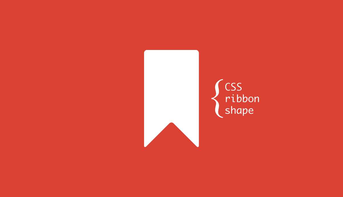
}How to create CSS Ribbon shape
The Ribbon shape is just borders of :before and :after selectors.
.ribbon-box .ribbon:before,
.ribbon-box .ribbon:after {
    content: "";
    display: block;
    position: absolute;
    height: 10px;
    bottom: -8px;
    border: 18px solid #53b0de;
 }
.ribbon-box .ribbon:before {
    border-bottom-color: transparent;
    bottom: -40px;
}
The corners are created by setting to transparent border-bottom-color property of :before selector.