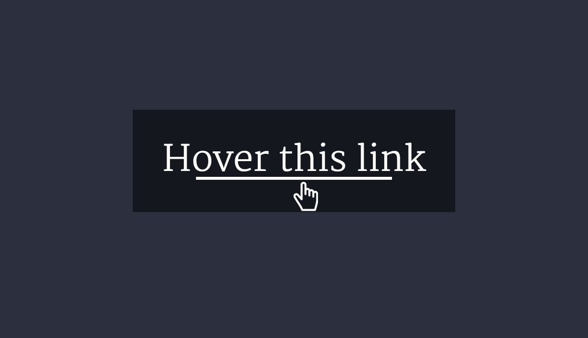
A simple CSS visual effect to animate links: when you hover text link, the link’s underline is revealed by animating it out from the center.
This Underline CSS transition doesn’t require any additional DOM elements or JS.
Underline CSS transition
a.animating-link {
position: relative;
color: #000;
text-decoration: none;
}
a.animating-link:hover {
color: #000;
}
a.animating-link:before {
content: "";
position: absolute;
width: 100%;
height: 2px;
bottom: 0;
left: 0;
background-color: #000;
visibility: hidden;
-webkit-transform: scaleX(0);
transform: scaleX(0);
-webkit-transition: all 0.3s ease-in-out 0s;
transition: all 0.3s ease-in-out 0s;
}
a.animating-link:hover:before {
visibility: visible;
-webkit-transform: scaleX(1);
transform: scaleX(1);
}
As result, we’ve got an underline that expands on hover:
Support: Browsers that don’t support CSS animations will just show up a regular underline.
Enjoy the code and feel free to use it!